"X-Men: The Last Stand" is a 2006 superhero film inspired by the X-Men superhero team from Marvel Comics. Following a series of strategic discussions with both the Fox International team in the United States and the Fox Japan marketing team, we concluded that it would be prudent to concentrate on the fundamental theme of "The Ultimate (Final) Choices." Consequently, the title was revised to "FINAL DECISION" for the Japanese market. It is essential to acknowledge that Japan possesses a distinct cultural viewpoint that contrasts significantly with that of Western markets. The visual elements, including color schemes and composition, adopt a graphical and straightforward two-dimensional style to better resonate with Japanese design aesthetics.
Client: 20th Century Fox International, 20th Century Fox Japan
Creative Director, Designer: Manabu Inada
Year: 2006
Creative Director, Designer: Manabu Inada
Year: 2006
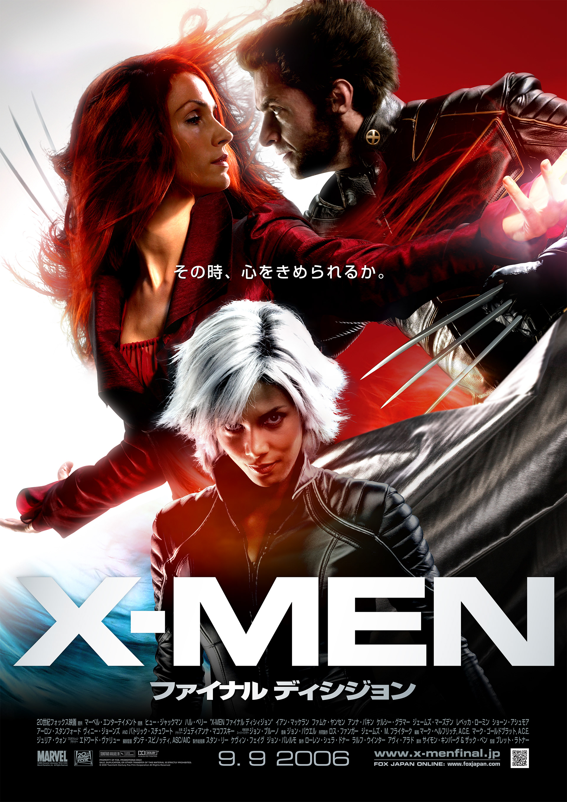
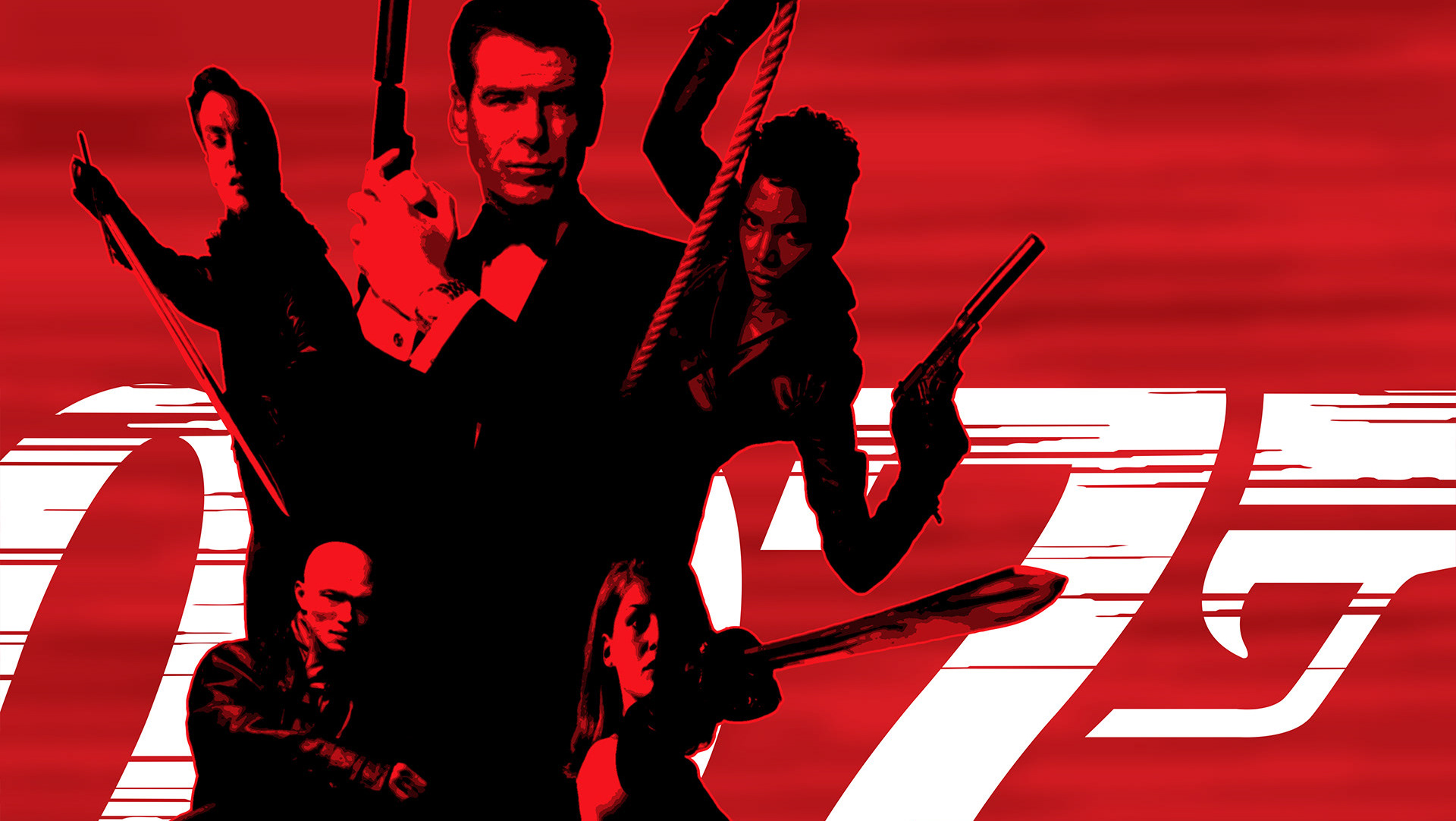
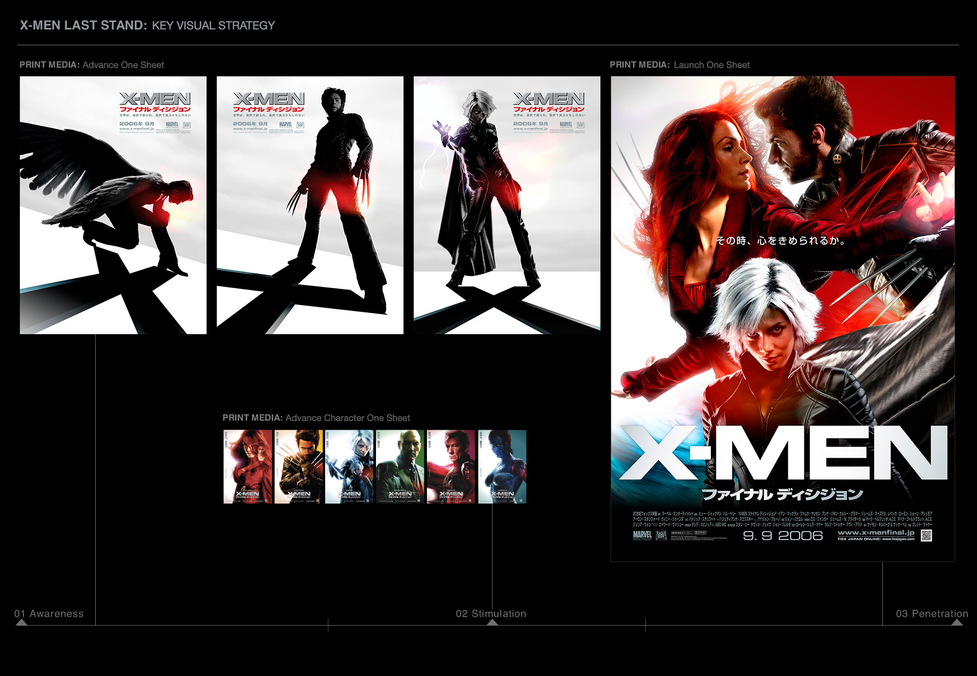
Launch Poster.
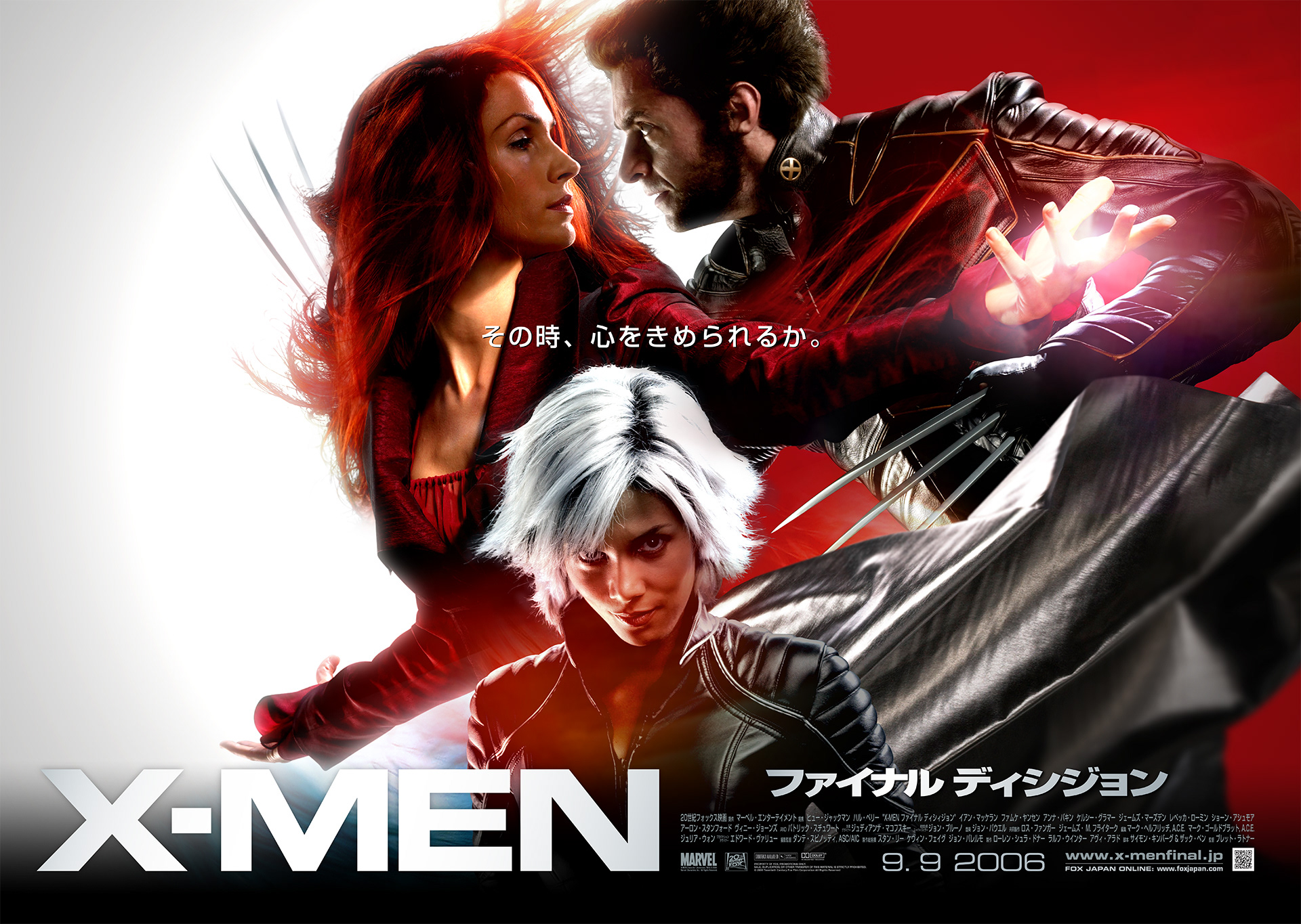
The primary focus of the characters is on Wolverine and Jean Grey, also known as Dark Phoenix, as depicted on the launch poster.
Strategic visual planning for a promotional campaign.
X-MEN LAST STAND: Trailer
Theatrical movie trailer for the Japanese market
Following a series of strategic discussions with the Fox International team in the United States and the Fox Japan marketing division, we concluded that our approach should center on the fundamental theme of "The Ultimate (Final) Choices." Recognizing the significant cultural disparities, it is evident that the Japanese market operates distinctly compared to Western markets. The promotional trailer was designed to highlight the characters' internal struggles, emotional dilemmas, and decisive moments.
Client: Twentieth Century Fox International, Fox Japan
Directed/Produced: Manabu Gaku Inada
Music: Hiro Kuretani
Post Production: Company 3
Year: 2006
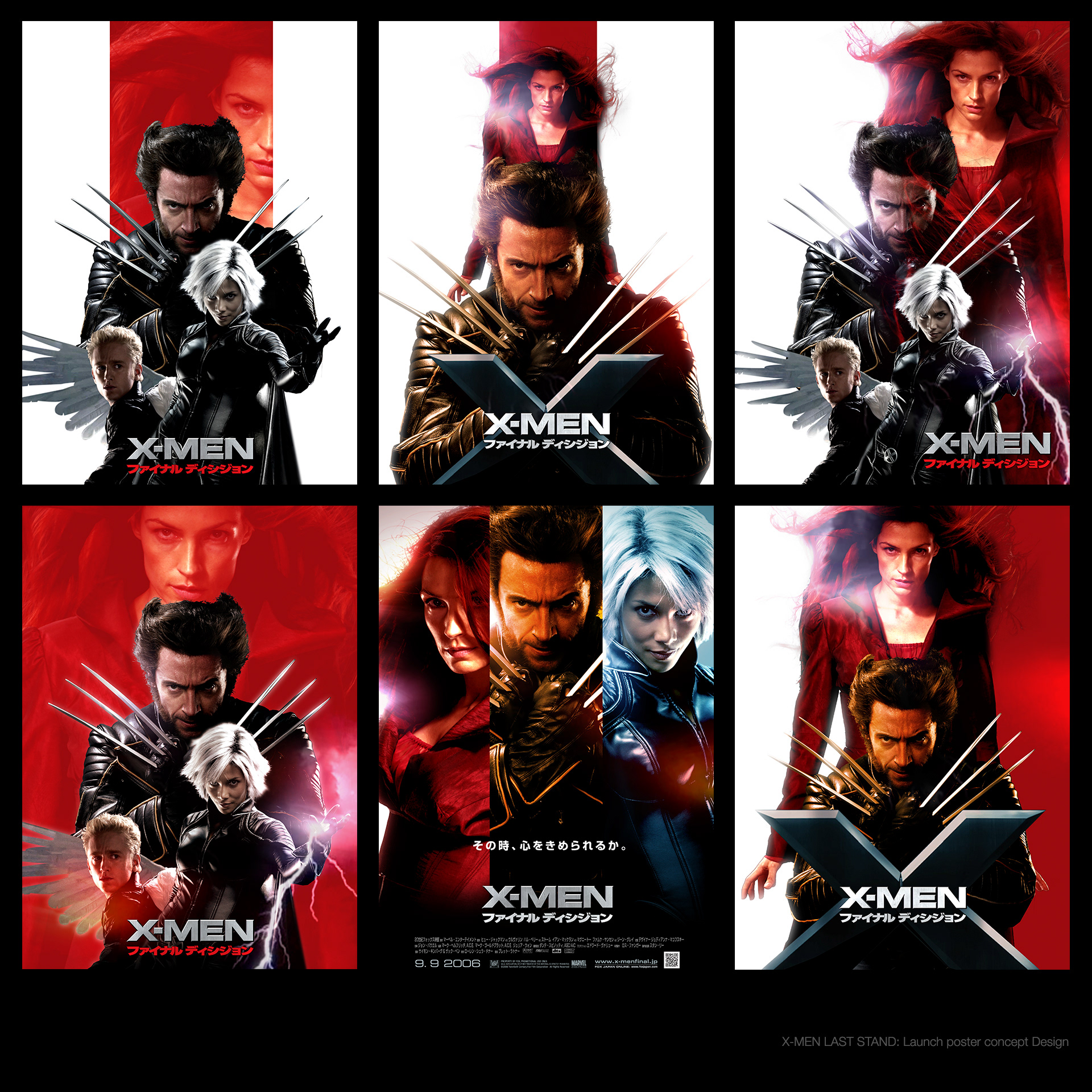
Initial conceptual design for the key visual of the launch poster.
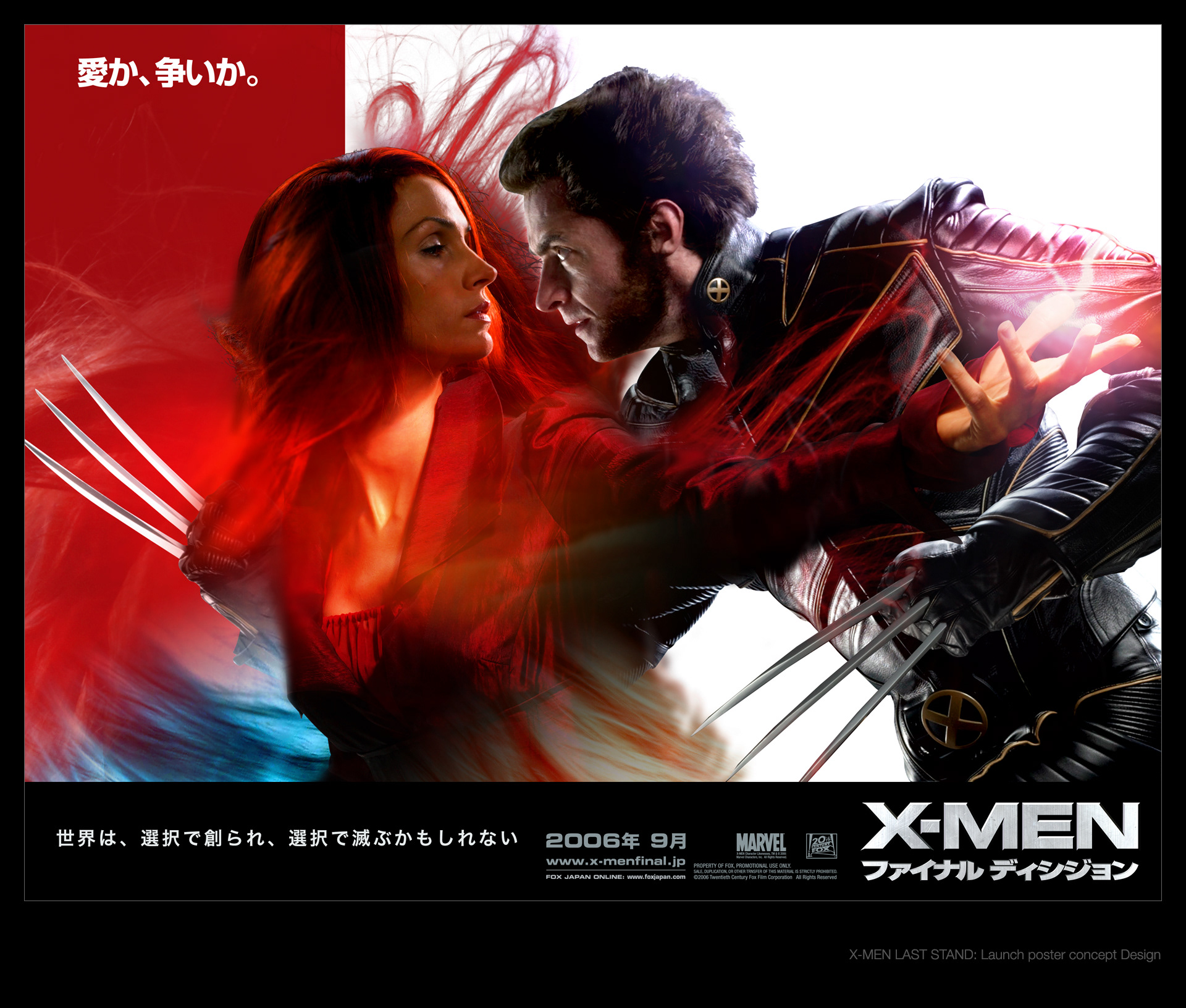
The initial concept design for the key visual, inspired by "Gone with the Wind," was created. It was later determined that Halle Berry, as Storm, must be featured on the same scale as the other cast members due to her contractual obligations with the studios.

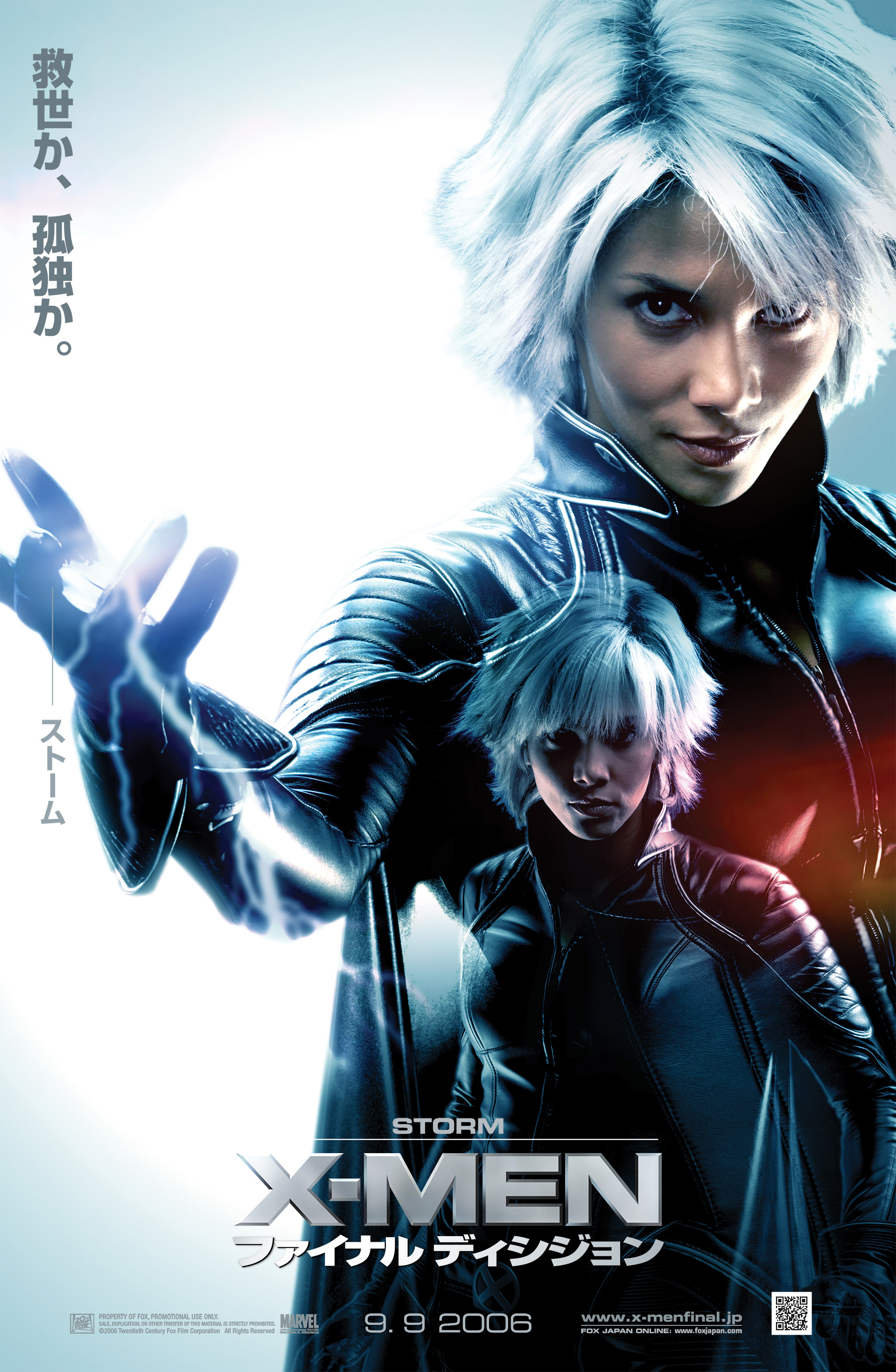
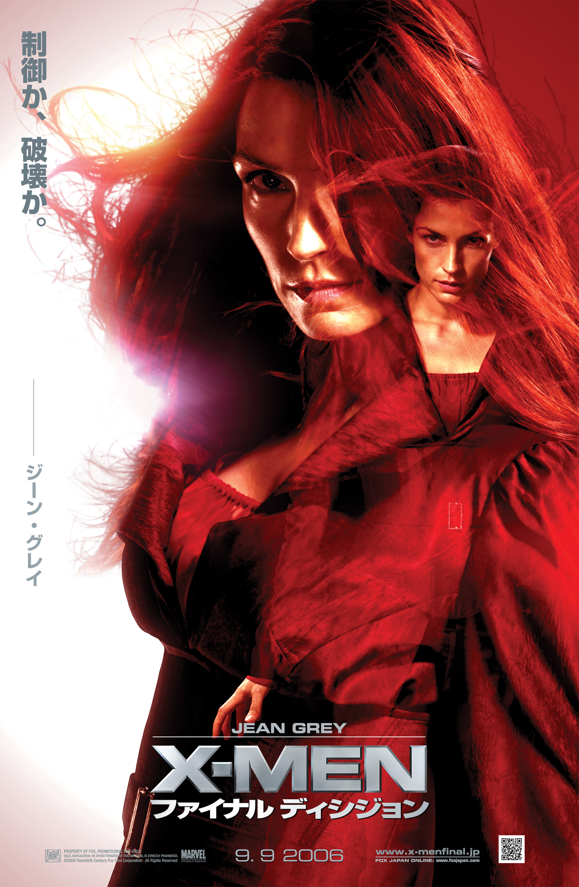
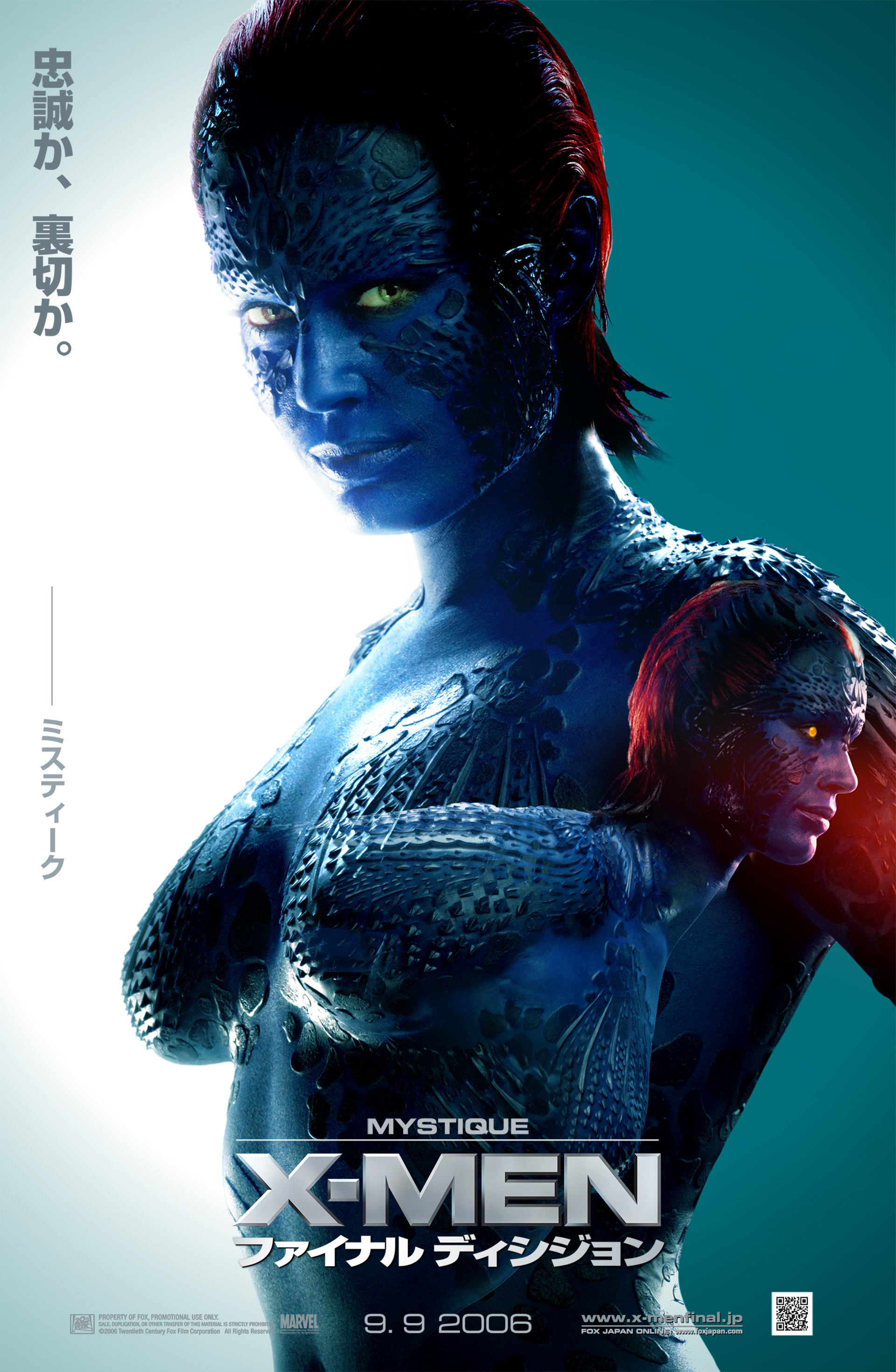
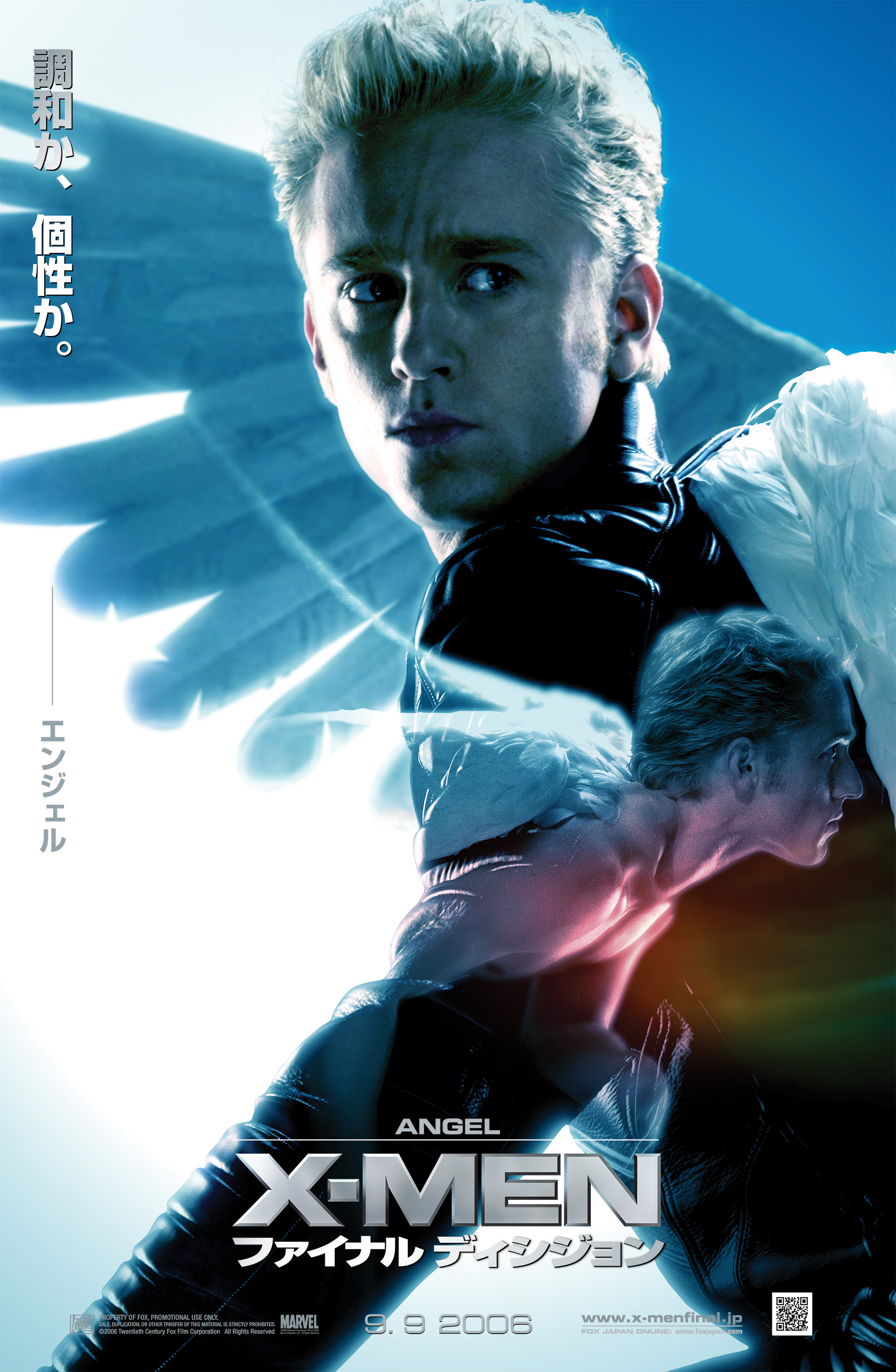
CHARACTER POSTER KEY VISUALS
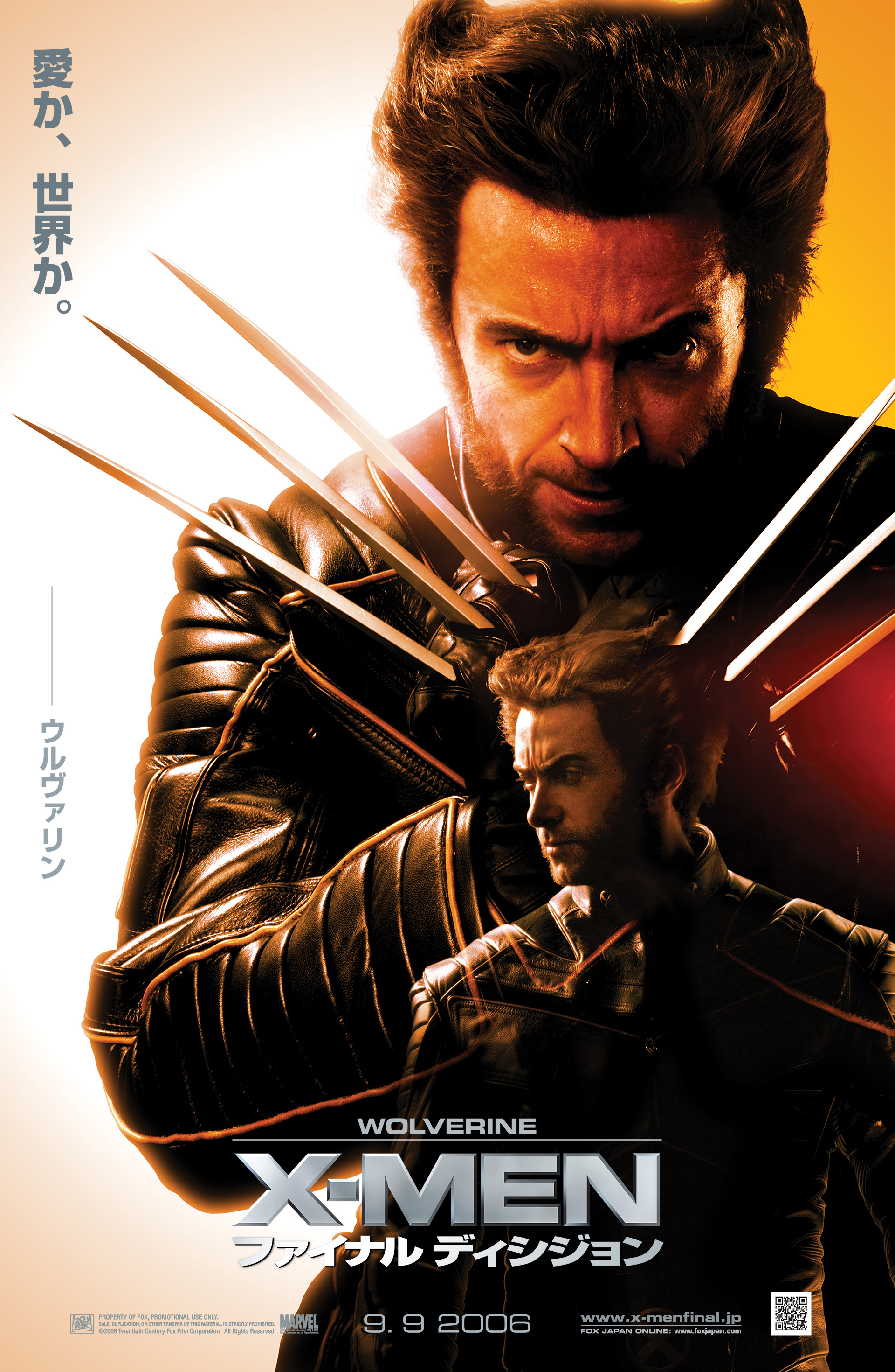
In 2006, the stylistic approach to feature film posters within the Sci-fi/Fantasy genre exhibited a homogeneous design trend. To distinguish our work from prevailing styles, we aimed to introduce a more distinct concept and a refined color palette for each character. The tagline and imagery of the characters serve to convey the internal conflict they face concerning their ultimate choices.


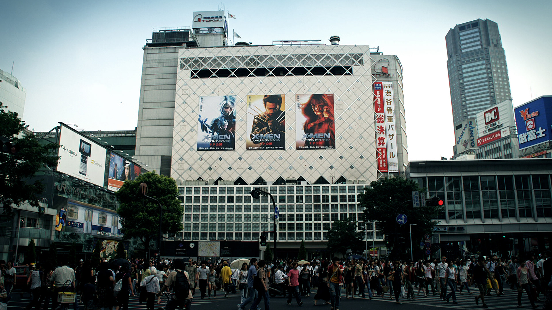
The X-MEN: FINAL DECISION billboard is prominently displayed at a major scramble crossing adjacent to Tokyo's Shibuya Station, which ranks among the busiest locations in the world.

X-Men: Final Decision - Advertisements are displayed on the opposing side of the station.
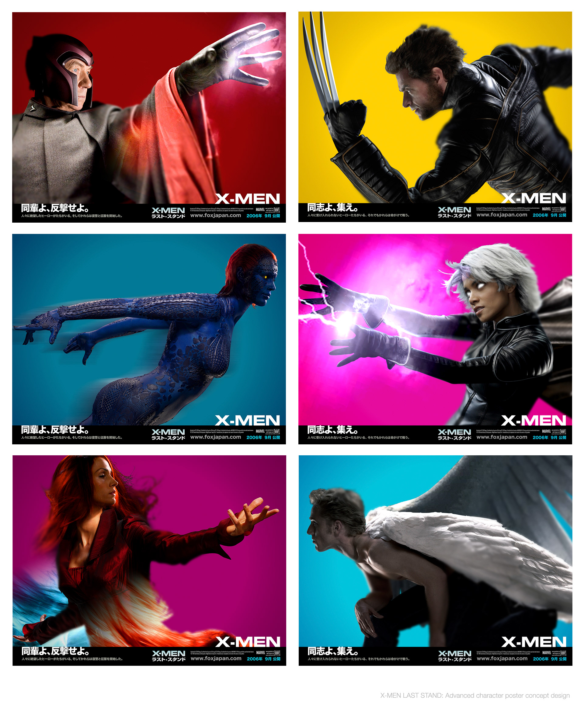
Early concept design of the character posters.